

portfolio
bourbon, framed as a gift
I helped reposition Total Bourbon around its strongest differentiator by building a creative strategy focused on gifting, personalization, and premium experience.

context
Understand problem, people and goals

approach
Build a direction with purpose

design
Shape ideas into thoughtful visuals

refinement
Test, tweak and improve what works

takeaways
Learn, adapt and carry it forward
context
finding the real differentiator.
Total Bourbon is part of a broader e-commerce spirits business focused on premium and hard-to-find bottles, with gifting services that include custom engraving, gift boxes, gift baskets, and corporate gifting support. Those gifting features are not peripheral to the business. They are a visible part of how the brand presents itself and a clear way it differentiates beyond simply selling rare bottles online. worked directly with our sales lead to understand the business challenge, audit the current creative direction, and shape a stronger strategy around what was actually driving value. The biggest gap was focus. Total Bourbon had a meaningful premium gifting story, but their advertising was not doing enough to sell that experience. My role was to help reposition the creative around that opportunity, build the visual strategy to support it, design the pitch deck, and present the creative direction alongside the sales lead.
approach
designing around buyer motivation.
The core shift I wanted to make was moving the creative away from generic product promotion and toward motivation-based messaging. I started by thinking through who was actually buying from Total Bourbon during the holiday and gifting season, and why.
What emerged was a clearer picture of three very different mindsets. There was the bourbon enthusiast looking for rarity, quality, and the satisfaction of owning something hard to find. There was the geographic seeker motivated by access, especially when certain bottles were scarce locally. And there was the gifter, who cared less about the bottle alone and more about what the gift communicated, whether that was thoughtfulness, taste, status, or relationship-building.
That distinction became the center of the strategy. Rather than relying on one broad bourbon message, I developed a direction that matched the offer more closely to the reason someone was buying. In this case, that meant leaning into personalization, premium presentation, and the emotional value of gifting as key creative levers.


design
turning gifting into the story.
For the creative mockups, I focused on showing how Total Bourbon could speak differently to different kinds of gift buyers while still maintaining a premium, cohesive brand feel.
For holiday gifting, I leaned into personalization as the strongest emotional trigger. The idea was that an engraved bottle immediately feels more thoughtful, more specific, and more memorable than a standard purchase. That led to creative built around engraved gifting, with messaging that highlighted the personal nature of the gift and the lasting impression it could make.
For corporate gifting, I took a different angle. A corporate buyer is not necessarily looking for sentiment in the same way. They are often thinking about presentation, professionalism, and the impression a gift makes on a client or partner. For that direction, I focused more on premium packaging, gift box presentation, and polished product staging to reinforce the idea of a higher-end business gift.
Across both directions, I used product imagery in more relevant settings to help the creative feel tied to a real moment. Instead of showing only standalone bottles, I mocked up visuals that reflected the context in which the gift would be given or received. That made the work feel more situational, more aspirational, and more useful.

holiday gifters
highlighting personalization of bottles for your brother or dad

corporate gifters
highlighting the nice glasses and packaging it comes in to impress your clients
I also extended the thinking beyond prospecting. For remarketing, I built the strategy around urgency and reassurance. Scarcity-based messaging helped push action, while social proof and credibility cues helped reduce hesitation. The goal was to create a stronger return path for interested users who needed a final push to convert.
One practical challenge in this project was that the client’s existing imagery did not do enough to support the premium gifting story. Their packaging and lifestyle visuals were limited, so I used AI-assisted mockups to place bottles into more polished settings and more accurately visualize the gift presentation. That let me show a stronger future-state direction while still staying grounded in what the brand actually offered.

scarcity play
encourage immediate action

customer reviews
reinforce credibility and satisfaction
refinement
building for response and return.
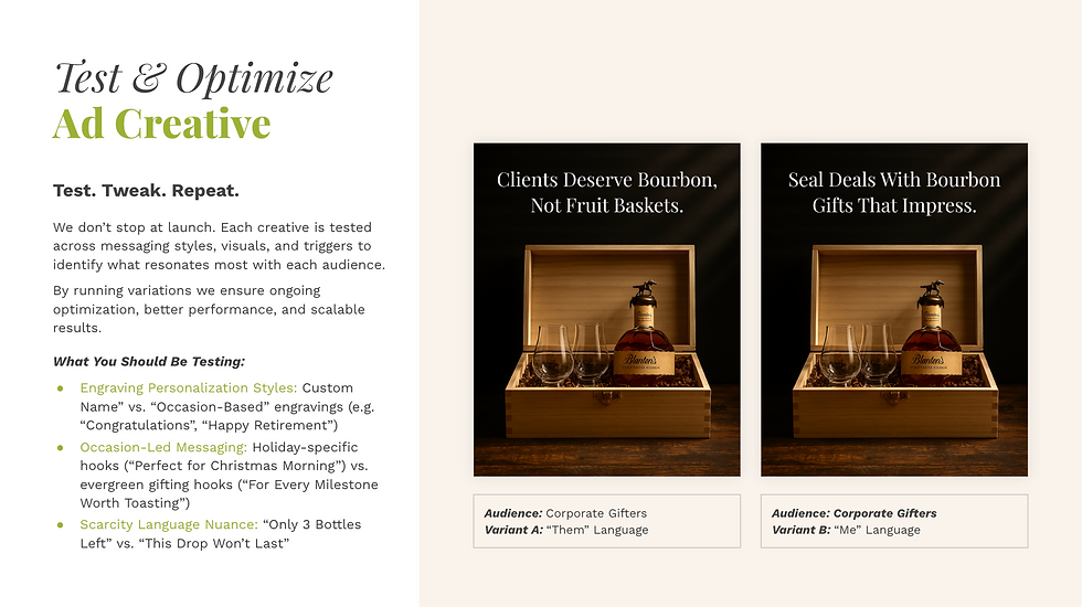
A big part of the pitch was showing that the strategy did not stop at a good-looking first round of ads. I wanted the client to see a system that could be tested, refined, and improved over time.
That meant outlining a creative testing framework around the variables most likely to affect response: different personalization styles, different gifting occasions, and different scarcity cues. For example, one version might emphasize custom engraving, while another might focus on milestone-based gifting. One message might feel seasonal and holiday-led, while another would work more broadly for celebrations, thank-yous, or client gifts. Another variation could test how direct or subtle the scarcity language should be.
I also worked to keep the larger story cohesive throughout the pitch. The audience insight, the ad concepts, the remarketing logic, and the testing plan all needed to feel connected. As with the Vivrelle pitch, I collaborated closely with the channel lead to make sure the creative direction and paid media thinking reinforced each other rather than operating separately.
takeaways
what i'm carrying forward.
This project reinforced how much stronger creative becomes when you stop leading with the product alone and start leading with the reason someone is buying. A bottle of bourbon can mean very different things depending on who is purchasing it, and the work needs to reflect that difference if it is going to feel relevant.
It also reminded me that premium does not come from design polish alone. Premium is built through context, presentation, and message fit. In this case, the most interesting part of the work was not just the bourbon itself, but the experience around it (engraving, packaging, presentation, and the sense that the gift would actually leave an impression).
On a more personal level, this project was also a fun reminder of how specific consumer behavior can get. I learned quickly that the bourbon world operates in its own universe of rarity, price sensitivity, and collector logic. That made it especially interesting to think through what different buyers value, and how creative can meet them in those moments with the right message.

Black Propeller site redesign
Led a full website redesign for Black Propeller that modernized the brand, clarified its value, and built a more scalable digital experience across marketing pages, case studies, and landing pages.

Leafside creative strategy pitch
Built a retention-minded creative strategy for LeafSide that reframed their meals from occasional purchase to easy health habit.

Icaro yerba mate tea giveaway
Designed the Meta ads, email, and landing page to launch Icaro Tea's giveaway promotion end-to-end.